#30DayChartChallenge for improving your DataViz skills
What is #30DayChartChallenge
#30DayChartChallenge is organized by organized by Cédric Scherer and Dominic Royé. This was the 2nd edition of the challenge. I participated in this challenge for the first time. I got to know about it on twitter. I learned many new things and want to share it here.
So, what’s the challenge??
The idea of this is to create and share one plot everyday. There were 5 categories and a sub-category for everyday. There was no restriction for which tool to use for creating the charts. You can use tool or any programming language of your choice. The whole point of it was learning and engaging in the community.
My Takeaways
I tried to create the charts in R and python. I did not produce chart for everyday. I made my mind before participating in the challenge to not to force myself for doing it everyday. I went on my own pace. Some of the categories were also new for me. The best part was I learned so many different things from others.
Here are some of the graphs I produced with R in this challenge.
1. Treemap in R
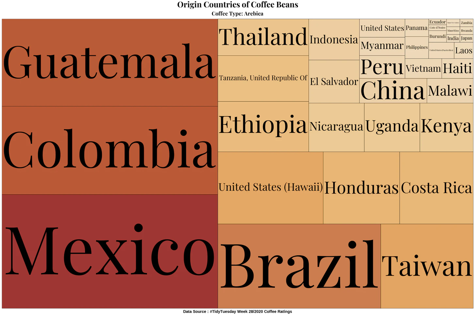
This was the day-1 of the challenge. The part to whole subcategory. I created Treemap in R and used the library paletteer for colours. I loved it and used it for all the R charts I created in this challenge. The treemap is about the Origin countries of the Arebica coffee.

2. Bubble Chart in R
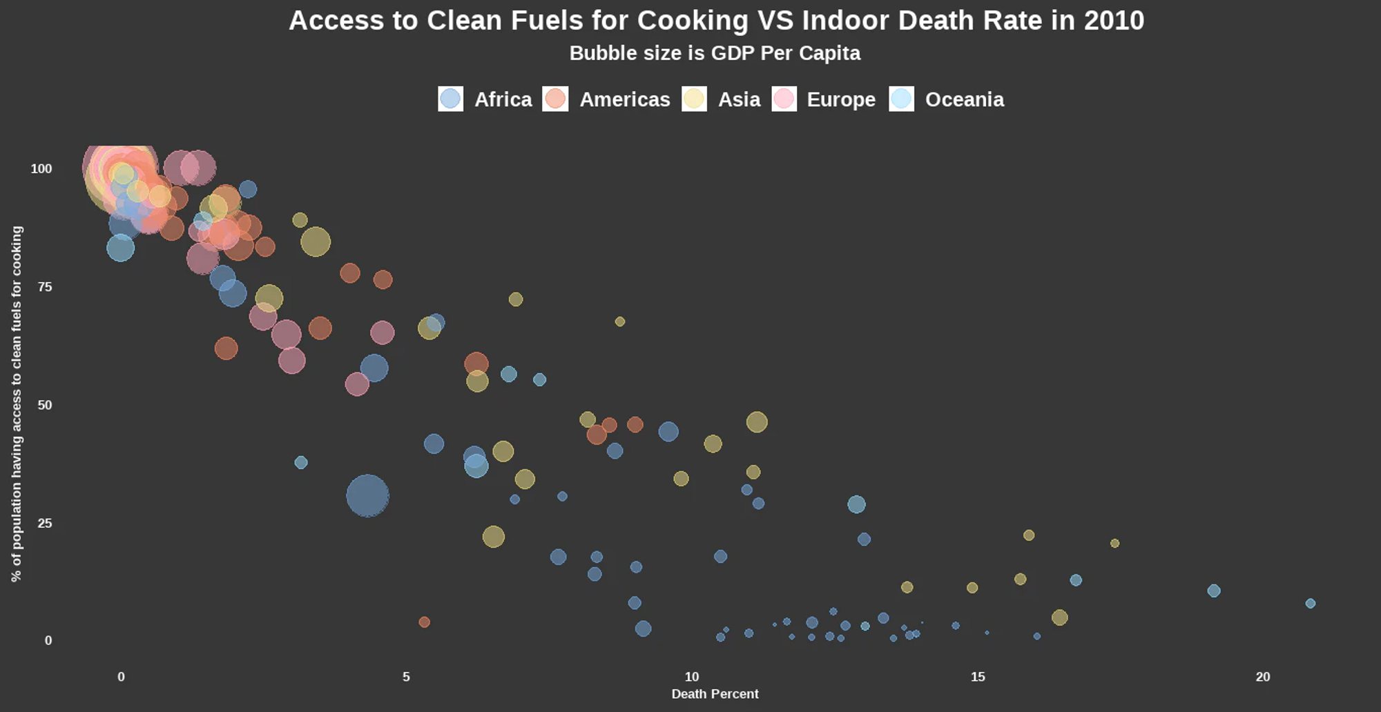
This was the correlation category. For this I tried bubble chart in R. I learned how to add continents in the data when only country name is present. In this chart the data is from 2010. In this chart we can see that the countries having access to clean fuel for cooking has least death percent.

3. Animation
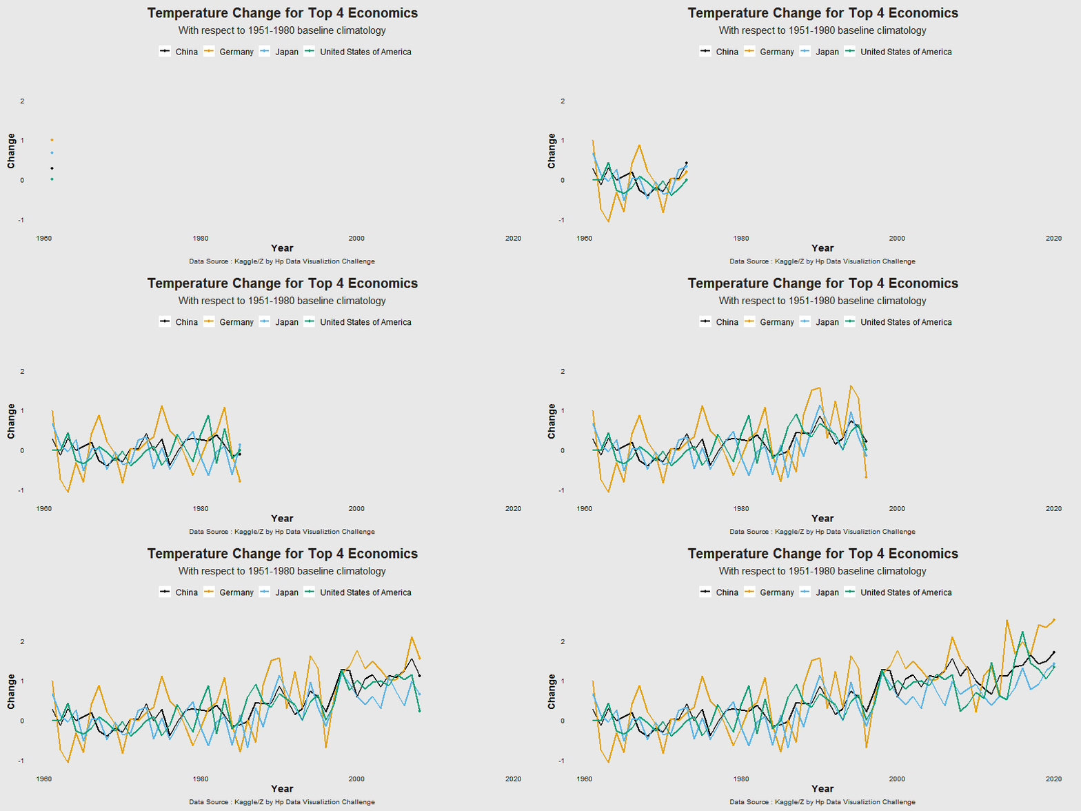
This category was really fun to work with. I created the animated line chart in R. I learned about the animation a lot while working with this category. This chart is about percent temperature change of 4 advanced countries. I created this using the library gganimate.

4. Adding text to Chart
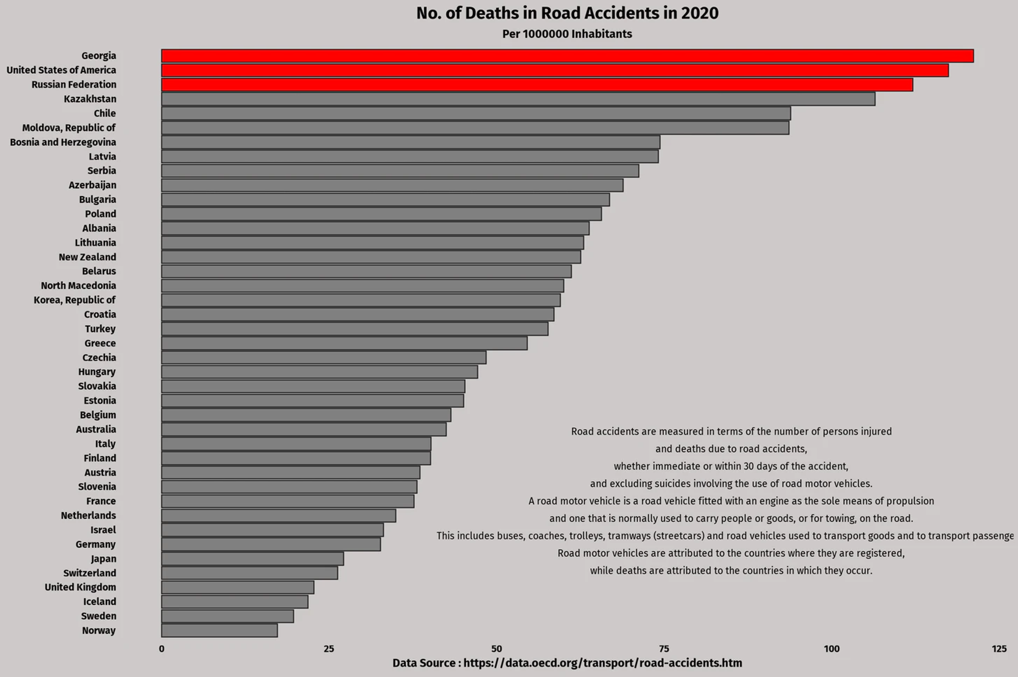
I created this chart for the OECD data day. While working with this category I learned how to add text in the chart and highlight particular bars in a bar graph. I added the text using library ggtext and annotate. This chart is about the number of deaths in road accidents for the year 2020 and highlighted the top 3 countries having maximum deaths.

I learned a lot during this challenge and I am still catching up on it. And I get better at googling things when I got stuck somewhere 😛😛.
I created the basic charts and tried to beautify them.
The only annoying part was that I could not find the data set sometimes. But for most the days I used datasets from TidyTuesday and Kaggle
If you want to see all the code for these charts, you can see it on my github repository
There were so many great contributors who’s Visualizations inspired me. Some of them are,
You too can participate and learn. Happy Learning!!📊📊